Input
input[type="text"]やinput[type="number"]などの代替としてテキストや数値を1行で入力させるコンポーネントです。テキスト・数値を1行で入力させるとき、フォームに入力欄を追加するときに使います。
使用上の注意
適切な幅に調整して使用する
入力する内容をあらかじめ精査し適切な幅になるよう調整して使用してください。
適切な幅は以下の判断基準を参考にしてください。
- Inputは常に1行で表示され、幅を超える入力内容を確認するにはスクロールが必要になってしまいます。十分な幅を確保してください。
- 入力する内容の文字数の予測が付く場合、過剰に幅を確保しないでください。過剰に幅を取ると入力するべきものがわかりづらくなったり、視線誘導の妨げになってしまうことがあります。
- フォーム全体で見たときにレイアウトに統一性がなく感じられるときは、他の要素とのバランスを考慮して幅を調整してください。
ユースケースに応じてコンポーネントを使い分ける
複数行のテキスト入力が想定される場合は使用しない
改行を含めたテキストの入力を受け付ける場合はTextareaを使用してください。
データの編集や送信を伴わない画面では使用しない
データの編集や送信を伴わない画面でデータを表示する場合はDefinitionListを使用してください。
入力項目の説明や例をプレースホルダで表示しない
入力項目の説明や例を載せる場合はFormControlのヘルプメッセージ(helpMessage)や入力例(exampleMessage)などを用い別途表示してください。どうしても表示領域が確保できない場合はTooltipを使うこともできます。
プレースホルダ(placeholder)を使い入力項目の説明や例を載せてしまうと、入力中にプレースホルダの内容が確認できず入力補助として成立しないため非推奨です。
Inputを使用したコンポーネント
開発で頻繁に利用する実装をコンポーネント化しています。
CurrencyInput
金額を入力させるためのコンポーネントです。給与・税額など金額値を入力させるときに使います。
SearchInput
検索キーワードを入力させるためのコンポーネントです。検索フォームで検索語句を入力させるときに使います。
レイアウト
プレフィックス・サフィックス
入力欄の前後にアイコンや単位を示すテキストなどの要素を置くことができます。
要素の設置判断基準
要素の位置と種類、位置に基づく役割は以下の表を参考にしてください。
| 位置 | 要素の種類 | 表示例 | 要素の役割 |
|---|---|---|---|
プレフィックス(prefix) | アイコン | 入力内容を想起させるために使用します。 | |
プレフィックス(prefix) | テキスト | 入力内容を想起させるために使用します。 一般的に内容に対して前方に置かれる単位(例: 米ドル)に用いてください。 | |
サフィックス(suffix) | アイコン | 操作を想起させるため、または操作を提供するために使用します。 | |
サフィックス(suffix) | テキスト | 入力内容を想起させるために使用します。 一般的に内容に対して後方に置かれる単位(例: 日本円)に用いてください。 |
入力内容を想起させるアイコンは、以下の判断基準を参考につけてください。
- 基本的には明確に必要なときにのみアイコンをつけてください。アイコンが多すぎると、ユーザーがアイコンの意味を理解することが難しくなり、開発者としてもアイコンを作成・選定するコストがかかります。
- SmartHR上で頻出する操作に関しては、アイコンをつけることを推奨します(例: SearchInput)。
状態
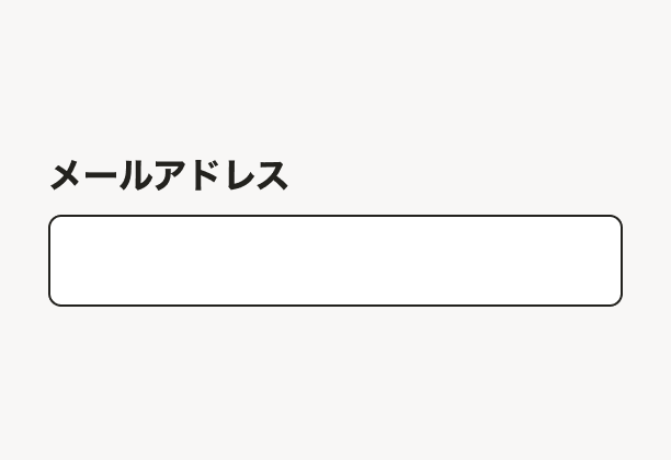
デフォルト
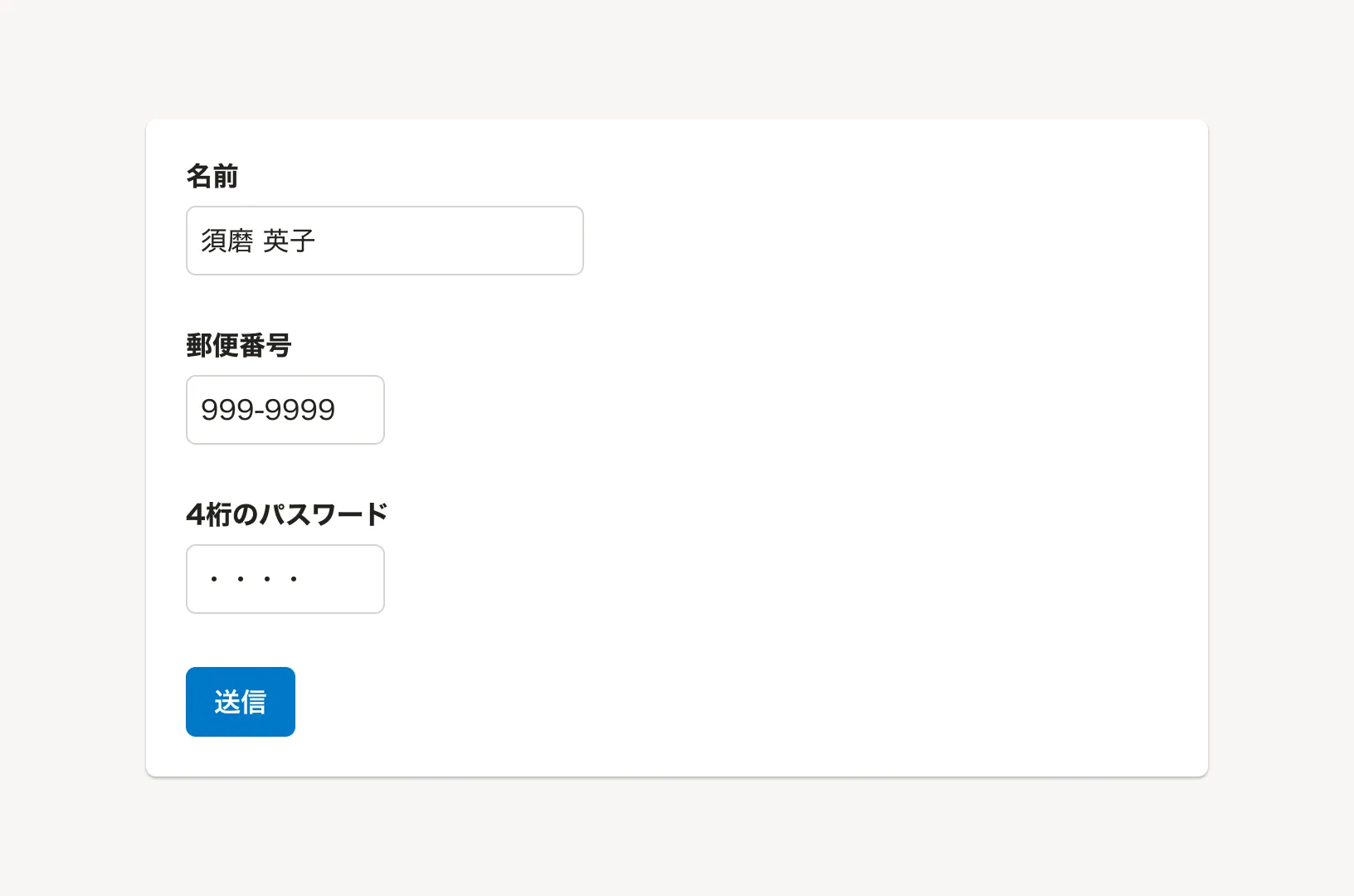
何も入力されていない状態をデフォルトとしてください。
ユーザーの入力作業が向上したり、ミスを減らせる場合にはデフォルト値を設定すること検討します。
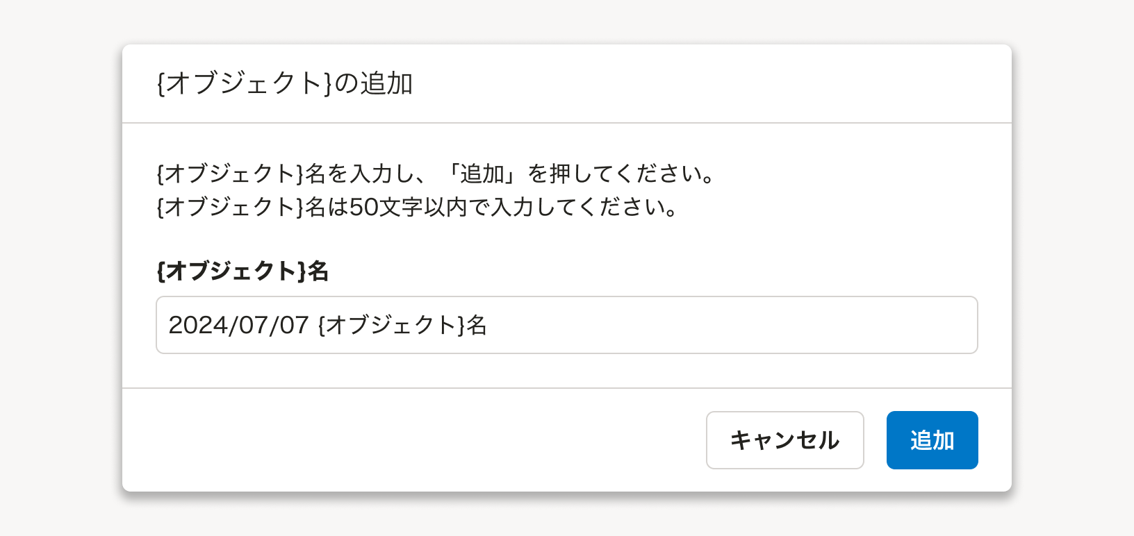
新規作成画面などで、Inputをオブジェクト名の入力欄として使用する際に、自動的にオブジェクト名を決められる場合は yyyy/mm/dd + オブジェクト名 のようにデフォルト値を設定することを推奨します。
読み取り専用(readOnly)
Inputの意匠を残しつつデータを表示し、入力は受け付けない状態を表現したスタイルです。
当該画面では編集できないが別の場所でユーザーが入力したことがあり、その値がフォームの送信内容に含まれていることを示すことが重要な場合に使用します。
例えば、すでに登録済みで変更できないメールアドレスを、入力済みとして送信したい場合に使用します。
無効(disabled)
入力を受け付けない状態を表現したスタイルです。
通常は編集ができるが一時的または権限の制約により編集ができない場合に使用します。ユーザーに編集させたくないが送信内容に含めたい値は、フォームには表示しないか読み取り専用(readOnly)を使用することも検討してください。
ユーザーはなぜ無効になっているのかわからないことがあります。権限による表示制御のデザインパターンを参考にして、そもそも無効ではなくフォーム自体を非表示にしたり、無効状態の理由を付近に表示することを検討してください。
モバイル
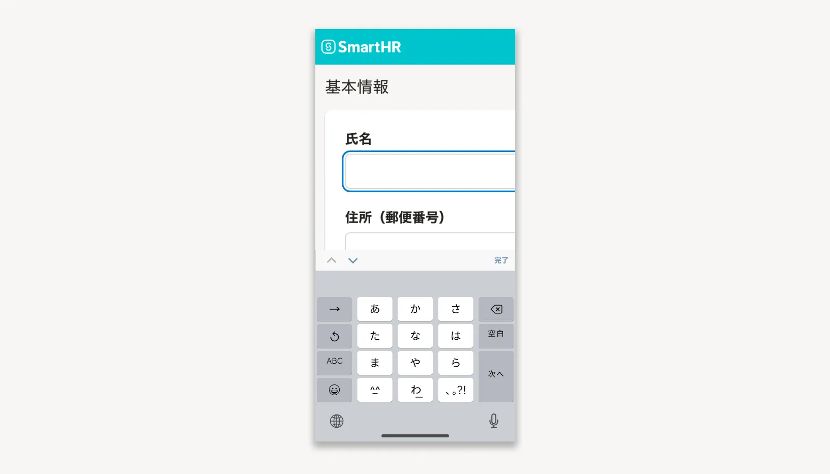
フォントサイズはM以上を使用する
一部のモバイル向けブラウザでは、Inputのフォントサイズが16px未満の場合、入力時に画面が拡大表示されることがあります。意図しない拡大を避けるため、InputのフォントサイズはM以上を使用してください。
アクセシビリティ
基本的なアクセシビリティ機能
FormControlとの統合
FormControlと組み合わせることで、ラベルとInput、補助テキスト、エラーメッセージが、それぞれ適切に関連付けされます。
強制カラーモード対応
ユーザーがテキストを読みやすくするために強制カラーモード別タブで開くを設定した場合、Inputのボーダーなどの色が適切に表示されるように実装されています(図1)。
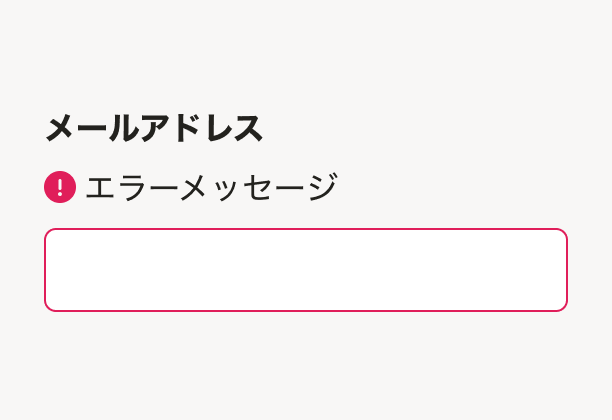
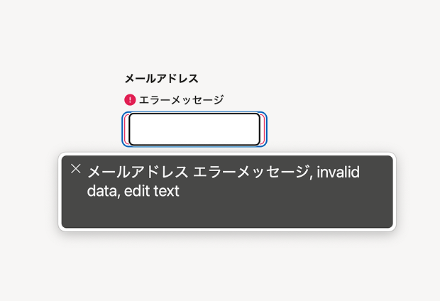
エラー状態
error属性を設定するとaria-invalid属性が自動的に付与され、スクリーンリーダーでフォーカス時にエラー状態であることが通知されます(図2-1、図2-2)。
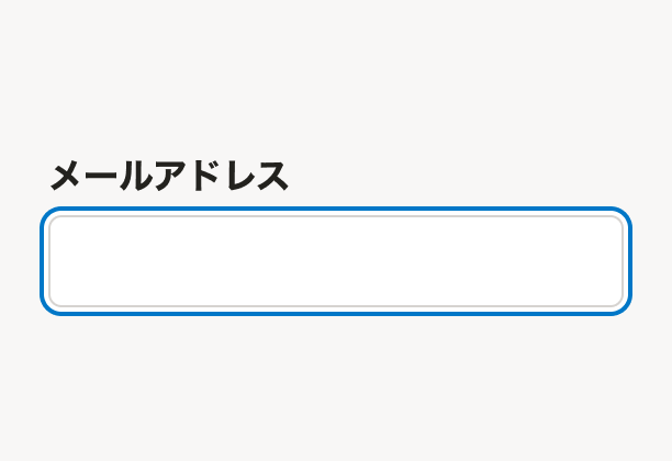
キーボード操作
- Tabキーでフォーカスの移動が可能
- フォーカス状態が視覚的に明確に表示される(図3)
関連するチェックリスト
簡易チェックリスト
弱視・ロービジョンのユーザビリティチェックリスト
開発時の考慮点
FormControlと併用する
Inputコンポーネントは必ずFormControlコンポーネントと併用して、ユーザーが何を入力すべきかを示すラベルを設定してください。FormControlと併用することで、支援技術にも入力の目的が伝達されます。
- eslint-plugin-smarthrのsmarthr/a11y-input-in-form-control別タブで開くルールは、InputにFormControlを組み合わせることを促すものです。支援技術に入力の目的が伝わらないリスクを防ぐため、有効にして使用することを推奨します。
アクセシブルネームの確認
設定したラベルがInputのアクセシブルネームとして正しく関連付けられていることを確認してください。詳しくは、フォームパーツにアクセシブルネームがあるを参照してください。
良い実装例
FormControlとInputを使用すると、label属性で指定したテキストはlabel要素で出力されます。可視ラベルとアクセシブルネームが適切に設定され、すべてのユーザーが入力内容を理解しやすいフォームになります。
悪い実装例
- FormControlを使用していないため、ラベルとInputが関連付けられず、アクセシブルネームが設定されません。支援技術を使用するユーザーには、入力の目的が伝わらず、フォームの内容を正しく理解しにくくなります。
- エラーメッセージがInputと適切に関連付けられておらず、スクリーンリーダーでフォーカス時にエラー状態であることが通知されません。
Props
@deprecated placeholder属性は非推奨です。別途ヒント用要素を設置するか、それらの領域を確保出来ない場合はTooltipコンポーネントの利用を検討してください。
input 要素の type 値
コンポーネントの幅
オートフォーカスを行うかどうか
コンポーネント内の先頭に表示する内容
フォームにエラーがあるかどうか
コンポーネント内の末尾に表示する内容
背景色。readOnly を下地の上に載せる場合に使う